Email notifications for various actions(like new friend request, new follower) play an important role in getting a user back to the site and making them perform an action (accept/deny or follow back). Also, given the huge size of various social networks and thinking of these emails as a customer touch point it’s helpful to have a nicely designed notification email template. I’ve written a couple of posts on the same earlier too.
In this post I’ll try to compare the notification email by various popular platforms for the basic action of getting a new friend,follower, subscriber etc and see whose doing what and what could they do to make things better.
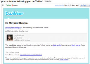
1) Twitter:
Format: HTML; Display Pic: Included; Call to Action: Visit profile; Direct Action: Block
This template is mostly good enough to decide if a user wants to follow back another user of not but by having a direct follow button would have helped.
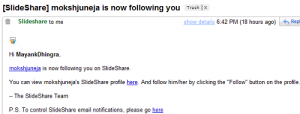
2) Slideshare
Format: HTML; Display Pic: Not Included; Call to Action: Visit profile; Direct Action: None
This template is plain and simple but it doesn’t have a display pic for new follower and it doesn’t have a direct button for an action. Also, it has two links which point to the same page, which isn’t the best thing .
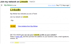
3) LinkedIn
Format: HTML; Display Pic: Not Included; Call to Action: View Invitation; Direct Action: Accept Invitation.
While Linkedin has a direct action button they don’t have any detail about the user in question. Here again a picture or some more description will be helpful.
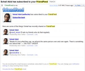
4) FriendFeed:
Format: HTML; Display Pic: Included; Call to Action: None; Direct Action: Subscribe back
Friendfeed has by far the best designed email notification template in which they have the display pic, last few updates and just one link to get direct action(subscribe back) from the user
5) Facebook:
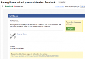
Format: HTML; Display Pic: Included; Call to Action: Visit request ; Direct Action: Accept Request.
Facebook has changed it’s notification from the older one (active till 14th september 09). While they have definitely gone the Friendfeed way, the name of direct action button is Login which doesn’t kinda look right.
Format: Text; Display Pic: Not Included; Call to Action: View Request; Direct Action: None
6) Orkut:
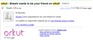
Format: HTML; Display Pic: Included; Call to Action: Visit profile and Visit friends page; Direct Action: None
Orkut too like slideshare has two links to the user’s profile and a third link which reads ‘visit friends page’ but it takes you to a separate ‘add friends’ page ala facebook. Also there is no direct call to action here too.
While there could be reasons for not having a direct action button for Facebook and Orkut(because they need to group friends into categories for example) some sites like Slideshare and Twitter can easily pick this.{Tip 1}
Having two links to the same profile page is definitely not wise and needs to be taken care off {Tip 2}. Other tips like having some profile info and a display picture can help {Tip 3} in a direct call to action(button etc) {Tip 4} if there is.
As you might have noticed eventually every notification email has moved to HTML format as it has more options like better looks and including a direct action call. {Tip 5}
What do you think about these email notifications?



Design/Usability of Notification Emails: http://bit.ly/HCqhd
This comment was originally posted on Twitter
Excellent article – it has made me put my thinking cap on because some aspects apply to page design in general.
Arbor SEO Designing Notification Emails: What you can learn from Friendfeed … http://bit.ly/13sQ18
This comment was originally posted on Twitter
Among the ones mentioned, twitter has the best notification email. But I guess they can improve it by mentioning the person’s bio and location apart from follower-following count.
They could add a URL too, but that would be blessing in disguise to online marketers and spammers.
Also Facebook could improve further by showing a small list 3-4 common friends.
Another thing that came to my mind as I read this was the load on the server for sending out such mailers? Does adding a profile pic create a huge load esp for huge sites like Facebook?
Interesting read RT @mayankdhingra Design/Usability of Notification Emails: http://bit.ly/HCqhd
This comment was originally posted on Twitter
@David: Glad you liked the blogpost, would like to know your learnings/realization on page design
@Balu: Before designing these templates one needs to answer the question that do the site owners want to increase some action(like more following back) or not. Also, they need to realize that giving more information might result in lesser web hits.
You have pointed out very valid points.
1) Twitter could definitely do good by adding bio and maybe URL too.
2) Facebook could take things to the next level by giving just names(not pictures) of common friends and yes, I guess there is a performance/scaling aspect too ( but then friendfeed is doing it)
RT: @chupchap: Interesting read RT @mayankdhingra Design/Usability of Notification Emails: http://bit.ly/HCqhd
This comment was originally posted on Twitter
Designing Notification Emails: What you can learn from Friendfeed and others http://url.ie/2gys
This comment was originally posted on Twitter
Mayanak,
I am interested in your comment about Slideshare, and Orkut having more than one link that leads to the same page.
Do you think that is also not wise on a web page?
@David:
From an email perspective the idea is to have minimum hyperlinks(ideally one) so that user clicks on the most important one and therefore no point in wasting hyperlink with repetition.
It’s applicable for a web page too I guess but I can comment better if I know the context(type of page, where does it fit in the workflow etc)